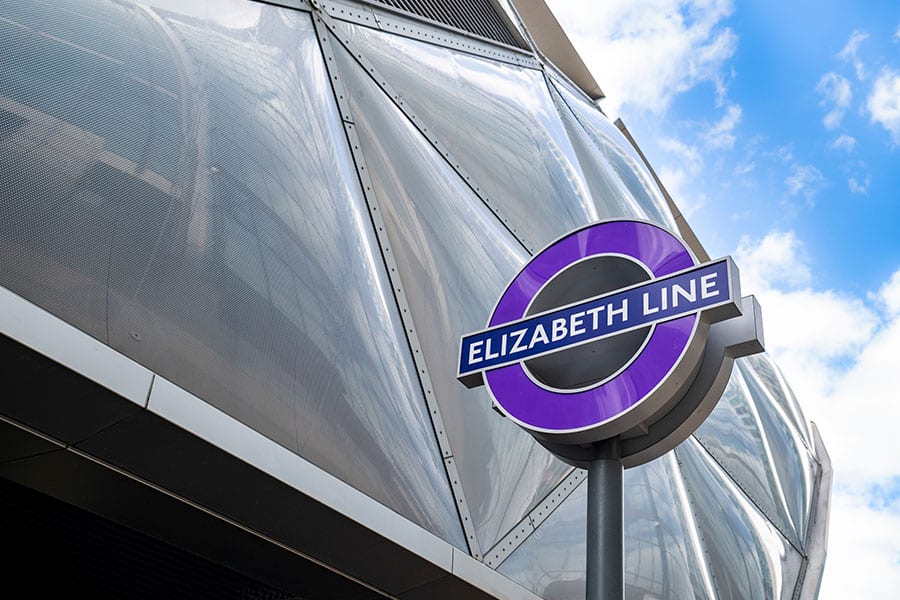
When England celebrated the opening of the Elizabeth line in London earlier this year, the media coverage largely focused on the technical challenges that accompanied the nearly two decades of the mass rail project’s construction. But more than just an impressive engineering feat, the line’s completion marked an important moment for English designers.
Each station was designed by a firm with London offices, reusing existing historic spaces or dreaming up designs that would add new intrigue to the city’s streets. Blending high-performance engineering and world-class design, the stations on the Elizabeth line have garnered praise from journalists, tastemakers and the more than 1 million Londoners who have ridden the line since it officially opened for business.
Built spoke with Rob Naybour, CEO of architectural firm Weston Williamson + Partners, about his experience creating two of the Elizabeth line’s most distinctive stations and the challenges and excitement of this decades-long project.
Two decades of collaboration
Naybour said that Weston Williamson + Partners began its involvement with the Elizabeth line in 2006, when the design process began. “We started building in 2009 and then we’ve been building ever since,” he said.
Naybour’s commitment to developing a more holistic approach to the design and engineering challenges the project presented his team began early in the design process. “We said to the people at Paddington, ‘You need a master plan and you need to pull this all together,’” said Naybour, whose team worked closely with Crossrail to develop a comprehensive organizational scheme that should be shared with all designers, contractors and clients involved in the construction process.
ALSO ON BUILT:
“At each stage we just wanted to stay involved,” he said. “It’s funny, because from the beginning to the end, the only people who were consistent were me and the Crossrail architect. I think on the first phase of Paddington Station we had something like 26 phased handovers, with different station arrangements. And one of the major handovers was to support the London Olympics, which was right smack in the middle of our construction program and was the busiest London has ever been in terms of moving passengers on the underground.”
Naybour and his associates realized that an unprecedented level of collaboration would be required for the project to succeed—a decision that resulted in the creation of a shared office space to ease communication. “We had a co-located office where all the station designers for the whole line were all working in the same office,” Naybour said. “I think it really enabled what was quite a quick program for the way things are procured in this country. I don’t think we could have achieved that without having a big co-located office and getting all the station designers together. All different architects, all different engineers, all working in their own teams, but sharing knowledge and ideas. It was quite an interesting process.”
Blending elegance and accessibility
For Naybour and his team, the intricacies of the design-build process were always concentrated on a specific goal: ease of movement and experience. “At the end of the day, what you’re really trying to do is make a complicated station seem very simple to the passenger,” Naybour said. “So you’re always looking for the elegant solution, which means that there’s an intuitive flow. You don’t need much signage because it’s obvious where you go. You need a big design vision that holds the whole piece together.”
Naybour said he believes that this design-vision approach is critical to creating a station that succeeds. “You’ve got lots of different sorts of people using the space,” he said. “I had a walk around just yesterday with a disability group, and generally the conclusion that we reached was that if the spaces felt good architecturally, then it puts people at ease. If you get the spaces and the ambience of the space right—the acoustics, the spaciousness, the right materials—then the rest falls into place, and the building then works for the widest possible range of passengers.”
How did Naybour and his colleagues achieve this vision?
“The big moves at Paddington were to really open the station up to natural light and to fresh air,” he said. “Funny enough, that was easier to do from an engineering and functional point of view, from the point of view of constructing it, and saved a lot of money. But it also makes for this incredibly intuitive journey, because as you arise from the platform, you can feel the fresh air, you can smell the rain quite often in London. You’re walking toward the light and the sunshine. So it is a much more visceral experience.”
A more holistic approach
Because both of the Elizabeth line stations the Weston Williamson + Partners team worked on were based on historic structures that were being redeveloped, Naybour said his team was able to bring a uniquely comprehensive point of view to the project while addressing the challenges posed by each existing site.
“The Woolwich station is in the old Woolwich arsenal, where they’ve been building guns and bombs and various armaments there since the 1600s,” Naybour said. “The space is being redeveloped as a mixed-use construction that includes museum, housing, art spaces and now a station. The work at Paddington included redeveloping an existing underground station, as well as the new Elizabeth line station.”
To work on the Paddington project, Naybour’s team had to keep traffic flowing through the existing station. “We needed to maintain operational platforms while we built a deck over the top, and these are not spacious stations,” he said. “So we had to understand the piling rig we could get in, which determined the structural grid we could use, which determined how we could thread staircases down onto the platform.”
Although the complexity of the sites presented challenges, working within the existing structures of a more comprehensive, larger scale construction space felt natural to Naybour. “I think for us, it’s always a holistic approach,” he said. “Because that is really the way the passengers see it. Your experience of a building, a transit station in particular, doesn’t stop at the front door. It’s part of a city experience. I think the more that you can think about those aspects, the more successful a project will be.”
Looking beyond the Elizabeth line, Naybour said he believes this comprehensive approach to transit design is essential to decreasing mass reliance on cars. “Public transport often fails on the last mile,” Naybour said. “We need to ask questions like: ‘What is it like to walk from the station to your final destination? Is it easy to get a taxi if you can’t walk? Is there shade? Is it busy? Are you protected from traffic?”
“All of those sorts of things are what makes it not only possible but enjoyable for people to rely on transit systems as part of their daily routine,” he continued. “And more and more, we find that cities are really thinking about that piece holistically, which is a challenge—but it’s good news for designers and it’s good news for the passengers.”


